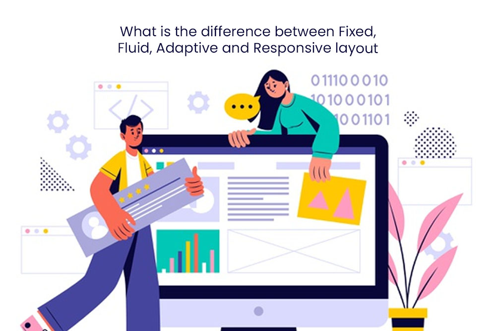
What is layout in websites?
Layout is the visual aspect of a website that may not be obvious to the users. It refers to the positioning and size of text, images and other content on a website.
Layout is often chosen based on what type of content needs to be presented and how it should be presented in order to present that content effectively. For example, if a website needs to show an article with a lot of text, the layout might feature large headings and narrow columns of text.
Fixed layout
Fixed layout is a design style that has become popular in the recent years. It is quite simple to implement and a lot of websites use this style nowadays. Fixed layout in websites is the most common design pattern used by websites. It gives a section of a website a single purpose and is easy to use, while still being visually pleasing.
Fixed-layout designs are helpful for displaying smaller sections of content, such as an article, the sidebar, or a call to action. This type of layout allows the reader to easily focus on what they need at any given moment.
Fixed layout is often used for content areas that are important to the website, such as navigation, search bars, and social media links. This design pattern can be seen in many websites all over the world.
A fixed-layout design can be implemented in both mobile and desktop websites by simply adding a few CSS rules from your site’s theme or boilerplate code.
Whereas Fixed-width designs are a great way to create a professional website. They offer designers and developers with a lot of flexibility and ease of use.
Some design considerations when designing fixed-width layouts
As you might be aware, web designers have been developing new ways to create fixed-width layouts for websites. This layout style has significantly improved the user experience with its flexible nature and ease of use. However, there are some design considerations when designing these layouts:
* Use divs instead of floats for paragraph blocks that should stay in place even if the screen size changes. If you do not need the paragraph to stay in place on smaller screens, use floats instead.
Fixed layout is a pattern of web design that displays content only in one column, which is typically the left-hand side of the screen. The content may be text, images, videos, or other interactive elements. Fixed-width designs are well suited to text-based interfaces such as search results pages and blogs.
Optimal fixed layout design dictates that each component has a clear width and height; this means that there should be no whitespace on the left or right side of the screen. A fixed layout generally uses columns with at least three different widths: a main column with one or two narrower columns on either side (known as “sidebars”). This can be achieved using padding in CSS where necessary.
Fluid layout
In general, the layout of a website is fluid and continuously changing.
Fluid layout is one of the most notable trends in web design in recent years. Its main premise is to create a website that adapts to the user’s screen size without any interruption or loss of content.
The concept was actually introduced by Ethan Marcotte who coined it as “responsive web design”. It has been implemented on mobile devices as well where it has received immense popularity due to its ease of use and high conversion rates.
Designers can use fluid layouts to create a website that is more intuitive and easier to navigate.
Fluid layouts are used in websites for the purposes of enhancing user experience. Fluid layout allows content to flow naturally from one point of the website to another. They are typically achieved by using parallax effects and other visual cues.
Fluid layout is a type of layout that can change or rearrange its parts and be re-configured to suit the needs of the content. It uses CSS layouts to create a single web page with horizontal and vertical fluidity.
Some of the factors that you need to consider when using fluid layout include:
– The width of your content container should be at least as wide as the screen.
– Make sure to use text-align: center, padding: next to center, or justify content within the container.
– Use CSS display property for blocks with horizontal lines.
In the last few decades, the Internet has exponentially increased in size. As a result of this, websites have become bloated and inefficiently designed. One example is that many sites now have a third column in their layout which makes it harder for users to find content they are looking for.
To combat these issues websites are now implementing responsive layouts which break up their content into multiple pages based on screen size and viewport width which allows them to make their site more user-friendly and efficient.
Responsive layouts also allow websites to be viewed on multiple devices such as tablets, smartphones or laptops without compromising user experience or design choices.
Adaptive layout
The web has evolved over the years. With new technologies and more powerful computers, websites have become much more interactive and dynamic. As a result of this, adaptive layout in websites has gained popularity.
Adaptive layout refers to the use of a website to change dynamically based on user interaction or activity. For example, if a user scrolls down the page in an infinite scroll, the content will automatically start scrolling at a faster speed while maintaining some control over where they are on the page. This is just one example of adaptive layout in websites. These layouts are made possible by dynamic web design techniques like progressive enhancement which allows you to build a single website that can cater for all browsers with minimum hassle.
An adaptive layout allows for more efficient use of screen space by fitting content into a smaller area of the screen without compromising readability or usability on mobile devices. It also allows for less scrolling required when using a mobile device due to increased focus on content rather than grid lines or navigation menus.
The most common and easiest way to implement this type of layout is CSS media queries. These are a set of CSS properties that can be used to define different style sheets based on the user’s device or screen size. For example, when your layout needs to change in order to cater for various sizes, you would create five different style sheets and then attach them with a media query in order for them all to change simultaneously.
Responsive layout
Responsive layout design is a new approach in web design. It is a mobile-first design that has evolved from fluid layouts to the more fixed grid layout.
The responsive layout design approach started with fluid designs, which were created by using liquid layouts that had no defined boundaries. The fluid designs were then replaced with more fixed grid designs, which are also referred to as “responsive grids”.
Mobile-first design is a new approach in web designing that has evolved from fluid layouts to the more fixed grid layout. This responsive grid can be used for any type of website and its aim is to adapt to different screen sizes or device types.
Since responsive layout pages are created with coding, it can take a lot of time for the website’s developer to build. The responsive design is also important for SEO purposes as it helps websites rank higher; it passes the Google mobile-friendly test which is considered the first step towards ranking high in search engine results.