
The Button UX Design Practices are a set of guidelines that were created with the goal of creating a better user experience and establishing an effective design process.
Over the last few years, button design has evolved from being static to being interactive and dynamic. Nowadays, designers are placing buttons in different places on the screen to help users complete certain tasks or to give them an option when they need it.
The Button UX Design Practices are the best practices that button designers follow in order to make sure their designs are not only appealing but also intuitive and simple enough for users to use.
Why button UX matters?
We often think about buttons as functional. They are clickable, and we know that they do something. We don’t consider them a part of the design process but the truth is that they can significantly enhance the user experience. Button UX can help solve many different problems such as creating clarity in designs, explaining complex processes and making users feel like they are being guided by the app’s creator.
What should be location and order of button in UX?
In a user interface, buttons that are at the bottom or towards the left of the screen are deemed to be less accessible. As a result, button placement isn’t clear.
The order of buttons in UX depends on the task. If a user is dealing with an abstract task such as browsing through photos then they would prefer to see images first and then scroll down to see all related information.
In many countries, the order of icons on a menu is fixed. In the US, it’s usually as follows:
Location:
- Icon representing the first menu item.
- Button with text indicating the second menu item.
- Button with text that indicates the third menu item.
- Icon representing the fourth menu item.
Order:
- Icon representing top/left main button.
- Button with text indicating third/right main button.
- Button with text that indicates second/bottom main button.
Difference between label and CTA of button in UX?
Button is the most popular UI element, which is used to trigger actions in mobile apps. For example, if you add a button to a mobile app’s landing page, it will typically be labeled as “Call Now” or “Book Now.”
The difference between label and CTA of button in UX is that labels provide more informational content which includes text, images, videos or links. On the other hand, CTAs are buttons that request action from users such as “buy now”, “sign up” etc.
The difference between label and CTA of button in UX lies on the context of which you want to communicate with your users. Label is a verb that communicates what action the button will perform. It tells them what they should do with it. On the contrary, CTA stands for call-to-action and it communicates what the user should expect from pressing this button. This can be anything from booking an appointment with your company to finding out more about your product or service in order to increase their customer lifetime value (LTV).
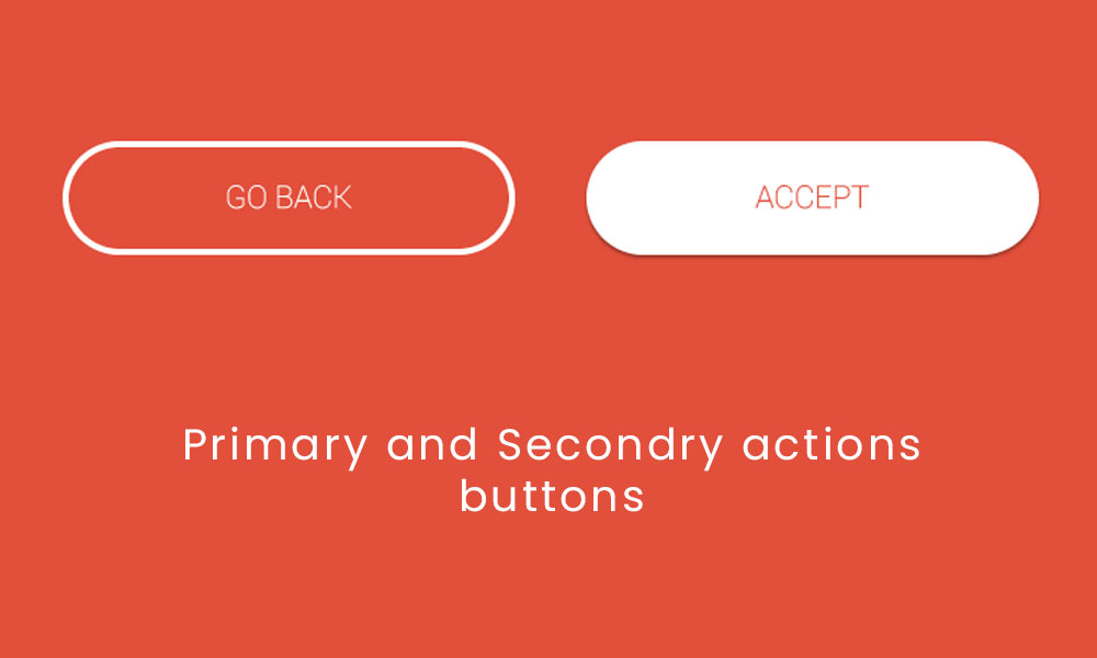
How to decide button shapes in UX?
Button shapes are a crucial part of UX design. They are the first thing users see when they enter a website or app, and they can make or break the experience.
But what shape to choose? There’s no one right answer, as it depends on your goal. For example, if you want users to take immediate action on what they see, you may want to go with something circular with sharp edges. If your goal is to create a more relaxed atmosphere where people can browse without feeling pressured into taking action, you may want to use a softer shape like an oval or rounded rectangle.
As a UX designer, you need to decide how the shapes of your buttons will influence how users interact with them. Buttons can be square, circular, or triangular. Here are some guidelines for deciding which shape is best for your project:
- Square buttons are best for content that needs more space and linear navigation. They make sense in designs where users will focus on more than one item at a time.
- Circular buttons create an elegant feeling that appeals to people with traditional tastes and can fit in well with other designs with round elements. They are also easy to recognise and use because they have no corners.
Types of button transitions
There are many types of button transitions that one can use in their websites. In order to be more efficient, one should know the different types and use them appropriately.
Here is a list of the different types of button transitions available:
Fade transition: the background color goes from black to white in a smooth motion.
Dissolve transition: the background color is removed in a smooth motion and replaced by another image or texture, like video or image overlay.
Explode transition: an image or video is shown on top of the button with lines exploding from it in all directions as it rises up against gravity, revealing new layers as it gets closer to its apex.
Zoom out transition: this type of transition allows users to see more content from where they currently are.
and many more….
Type of Button Behavior
Different types of behaviors can help with ensuring that the reaction an action has on the user is properly conveyed and understood.
The four most common types of button behavior are:
Hover: The text or image under the button changes when it hovers over it.
Clickable: The text or image under the button changes when you click on it, then disappears when you release your mouse/finger from clicking.
Button Swap: Two buttons are swapped over each other, then one disappears while the other remains unchanged until they are both clicked again at which point they exchange places by pressing both buttons simultaneously.
Reversible Switching: The idea of Reversible Switching in button behavior in UX is that if user clicks on the button, both the button and its label can be either active or inactive. This feature helps users to understand what to do with the switch easily by highlighting possible options at one time.
What is floating action button?
Floating action buttons (FAB) are a type of button that appears as a floating control on the screen. They are designed to give users quick access to common tasks, making it easier and faster for them.
A FAB usually consists of an icon with a label, which can be tapped or clicked to trigger an action like uploading a photo, playing music, etc. The FAB is positioned in the top left corner of the screen and floats on top of other interface elements. It is also used for navigation in apps where the user needs quick access to different screens like settings or home screen.
The floating action button has become one of the most important parts of apps UI because it simplifies many interactions for users by reducing hand movements and taps along with giving them quick access to frequently used functions