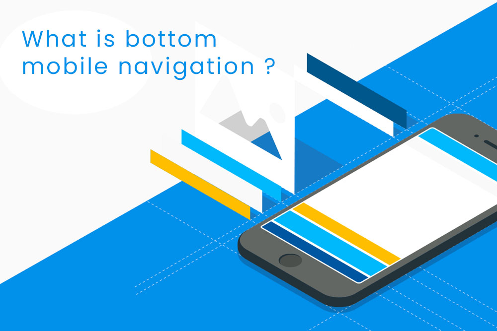
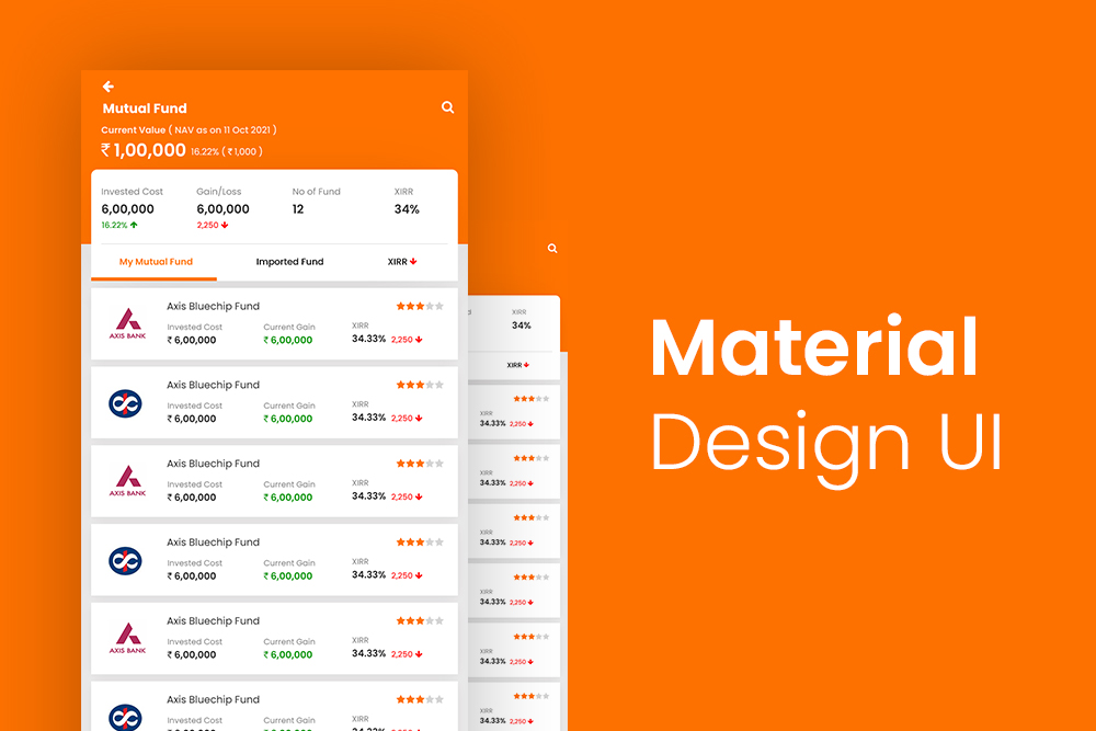
Bottom navigation is a mobile navigation method that places the “amenities” or resource content at the bottom of the screen.
This is a navigation model that is employed by mobile apps. It’s like a sidebar that slides in from the bottom of the screen.
The bottom navigation model has been popularized with social media apps like Instagram, Facebook, and Twitter. It’s a convenient way to navigate through your app without having to scroll up or down constantly.
How bottom mobile navigation gain popularity?
As devices become bigger, people are currently using bottom navigation for their phones.
The popularity of the bottom navigation has been on the rise since Android Lollipop. This is because the notifications are shown in this section of the interface rather than at the top.
As apps get more complex, and there’s more information to take in, most users have found it difficult to find their way around without a lot of time-consuming scrolling. Bottom navigation has been designed to be easy and convenient for users who need quick access to options without having to go through different menus or screens.
Many companies have found success with bottom mobile navigation because it is easy to engage with and has high conversion rates.
Important factors for bottom mobile navigation?
Mobile navigation has become an important factor for both digital agencies and their clients. It can be thought of as a lifeline for mobile users. Therefore, it is quite important for businesses to put in extra effort and make sure that their mobile navigation is as easy to use as possible.
Some of the factors that are considered when designing bottom mobile navigation are:
- ease of use
- speed of navigation
- recall rate
- user experience
- readability
- placement of menu items
- relative location to the home button
Why design important destination in bottom navigation?
Designing the bottom navigation is very important because it’s usually the first thing a user will see when they visit your website. It’s important to make sure that these destinations are designed to be easy to find and understand.
The bottom navigation is a very important part of website design. It’s where you’ll find the most important resources for your visitors. But it can also be the hardest to design accurately.
There are many reasons why someone would want to design an important destination in this navigation, including increasing your search rankings, making it easier for people to share content on social media, and even improving conversions (if you’re using a shopping cart or lead form).
Why to Avoid Scrollable Content in bottom navigation?
Scrollable content in bottom navigation can make the website slow and more challenging for users to navigate. It usually leads to less engagement and lead to a drop in traffic.
scrolling is tedious and inconvenient, especially when people are trying to read content on a small screen. It takes time and effort just to scroll through a list of links on mobile devices.
Scrollable content makes it difficult for users to identify what is important and what are the most recently published content. This can lead to a higher bounce rate and lower time spent on site.
What is scrollable content? Scrollable content is any type of content that scrolls horizontally across a screen, like an endless list of articles or blog posts, or a carousel feature like slideshows.
Type of icons we can use in mobile bottom navigation?
When it comes to bottom navigation in mobile, we need to think about the different types of icons that we can use for better design.
A) Simple icons: These icons are highly recognizable and easy to use. You can also use photography or illustrations.
B) Icons with text: These icons are effective if you want your app or website to stand out from the rest and make your users have a clearer understanding of what they are supposed to do.
There are a variety of icons you can use to add in the bottom navigation on your mobile website. Some icons may be suitable for one type of site and some for another.
The most common icons include:
- Search icon: This is used when you want to highlight a search option.
- Menu icon: This is used when you want to highlight different options that are available for your users.
- Close icon: This is used when you want to close the current page or hide it from view.
Best colors to use in mobile bottom navigation?
The best color to use in mobile bottom navigation depends on the type of content one is targeting. For sure, red is an eye-catching color and people are naturally drawn to it. It’s also a great choice for content that has an urgent tone – like healthcare and legal services.
Orange is another color that works well in mobile navigation. This makes sense since orange has been used as a symbol of energy and excitement in various cultures, including American culture.
There are various colors that one can use for the bottom navigation. You can choose from light shades, warm shades, cool shades, dark shades or any other color combinations.