A flexbox is a type of tool used for laying things out like posters or artwork on a wall space in such a way that all sides are equal length but different widths (the height depends on the contents. CSS Flexbox is a new layout mode in CSS3 that aims to provide more flexibility and control over the positioning and sizing of elements. It was introduced to allow us to create layouts which are more responsive, using items which are able to change their size, position and order depending on what device they’re being viewed on. It’s also been designed so that it works in a similar way as when we use flex items in a web application.
What is CSS Flexbox Layout?
CSS Flexbox Layout is a powerful web layout model, enabling the use of constraints to create flexible and responsive layouts. CSS Flexbox Layout is a module in the CSS specification. It was designed to simplify the process of creating layouts and implementing design patterns.
Responsive design is not just about resizing your website to fit different screen sizes; it’s also about adapting the layout and design to show more or less content depending on the size of the browser window. The CSS Flexbox Layout module makes this easier by giving you a new tool for building adaptive layouts. It allows for web pages to behave more like physical paper, by distributing space for elements horizontally or vertically. In other words, the width of the flex container can be controlled by the browser, in order to fill all available space on any given device.
The idea behind using this layout method is that the UI can be rendered responsively across various devices, without the need for changes to user code. For example, if you want your site’s navigation menu to occupy 100% of the width on tablet devices, but only 50% of its width on desktop screens then you can do so using CSS Flexbox.
justify-content
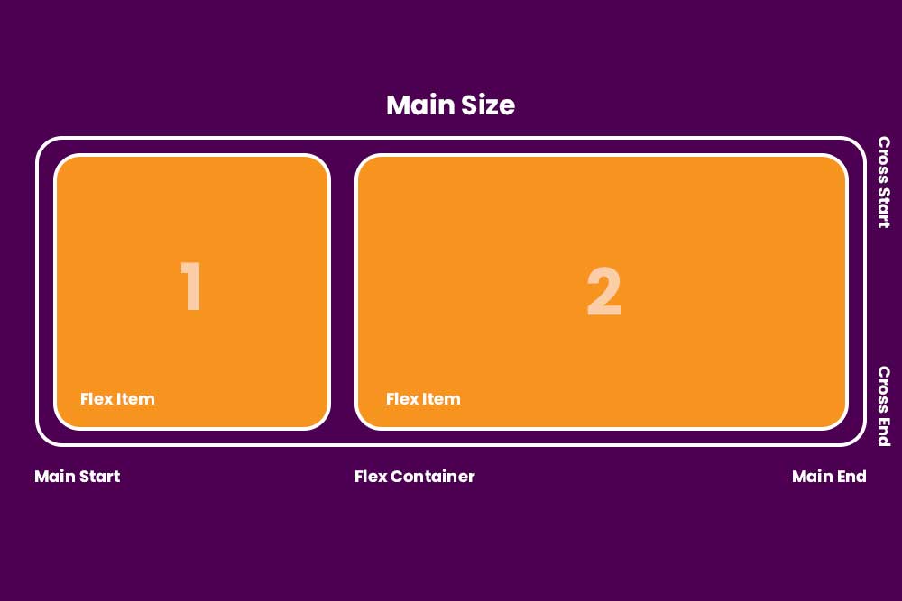
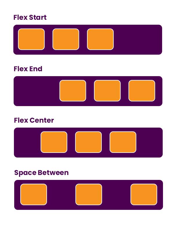
The justify-content property is a part of CSS3 Flexible Box Layout. This property determines how space is distributed between the parts of a flex container.
This property takes one of these four values: flex-start, flex-end, center or space-between. The following rules apply:
if the box has an even number of items and justify-content is set to flex-start, then each item starts on the left side of the box at a point equidistant from where it last ended. However, if justify-content is set to flex-end (or not set), then each item starts on the right side at a point equidistant from where it last ended. The justify-content property controls how the content inside the flex container is laid out. If set to `center` then the item will be centered. If set to `space-between` it will push items away from each other, and if set to `space-around`.
.container {
  justify-content: flex-start | flex-end | center | space-between | space-around | space-evenly | start | end | left;
}
flex-direction
This property specifies how flex items are distributed along the cross-axis of the current line of items. It can be set to one of three values: row, column and a combination of row and column, which creates a mixed layout.
The flex-direction property is used in conjunction with the other flex properties, such as direction and justify-content to create a responsive layout which automatically adjusts to changes in browser size or device orientation.
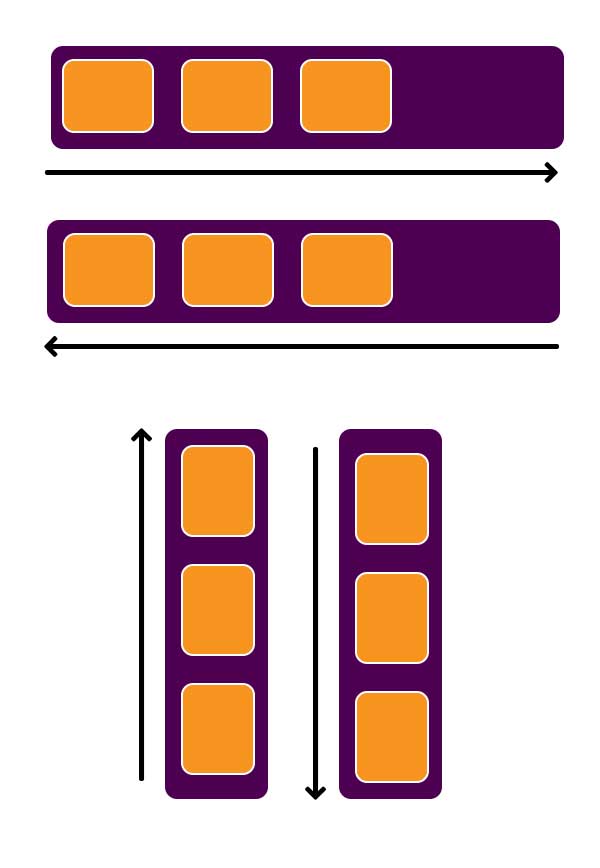
This section is about the css flexbox layout element called flex-direction. The flex-direction refers to which direction the items in a row will be laid out. The options are: column, row and row-reverse.
Each option has its own usage case, but the common theme is that it allows for greater control over how content items are spatially distributed on your page.
Row – The default, left-to-right direction.
Row-reverse – Reverse direction from left to right.
Column – The vertical stacking for all items that are not in a row.
.container {
  flex-direction: row | row-reverse | column | column-reverse;
}
Flex Item Layout
Flex Item Layout is a CSS module that allows you to use space between flex items.
This is a module of the CSS specification (Cascading Style Sheets) that defines the display property. Firstly, it allows items to be laid out in rows or columns. Secondly, it allows for spacing between items. The ability for flex item layout to create more room for content if the available space changes ensures that all the content can be seen and read by users.
The main difference between Flex Item Layout and Rows is that Flex Items can also be laid out in single rows or columns (but not both).
css Flex Item Layout is a new css layout system, which came out of the box with css3.
Generally, it has three components:
– Layout items: flex container and flex items
– Flexible length: specifies how a flex item should be sized relative to other items
– Flexible side: specifies how a container should distribute extra space in total among its flex items
Sizing Flex Items
In Flex layout, items are automatically sized and aligned to fill the available free space. A flex container is the element that has a size set or is an immediate child of a flex container. This article goes over some of the properties that make up this layout mode.
Using the flexbox, we can use the flex items. Flex items are the queries that contain a size, such as “10px”. They can be mixed with other queries and queries.
When you set a value for “flex-grow” or “flex-shrink” for a query, it takes precedence over any of the other flex item queries, regardless of their order in the CSS document.
{Please add code}
Flex Wrapping
When a parent element has the flex-wrap property set to wrap, any lines of items that do not fit in the container continue on one or more subsequent rows until they are completely visible.
This property can be used with items that only take up one line, such as images or buttons, creating interesting layouts where there are variable numbers of columns. And while it is not a display type in its own right it can accept the full range of display types that absolutely positioned content can. In other words, a flex container will behave like an inline-block layout if its “flex-direction” value is set to the default “row” value.
.container {
  flex-wrap: nowrap | wrap | wrap-reverse;
}
Advanced Flexbox Properties
CSS Flexible Box Layout is a powerful layout mode with many properties, which confuses many web developers.
We will explore some of the most complicated and powerful Flexbox Properties in this tutorial. These properties are:
Flex direction
Align self
Baseline alignment
Cross axes alignment
Ordering children