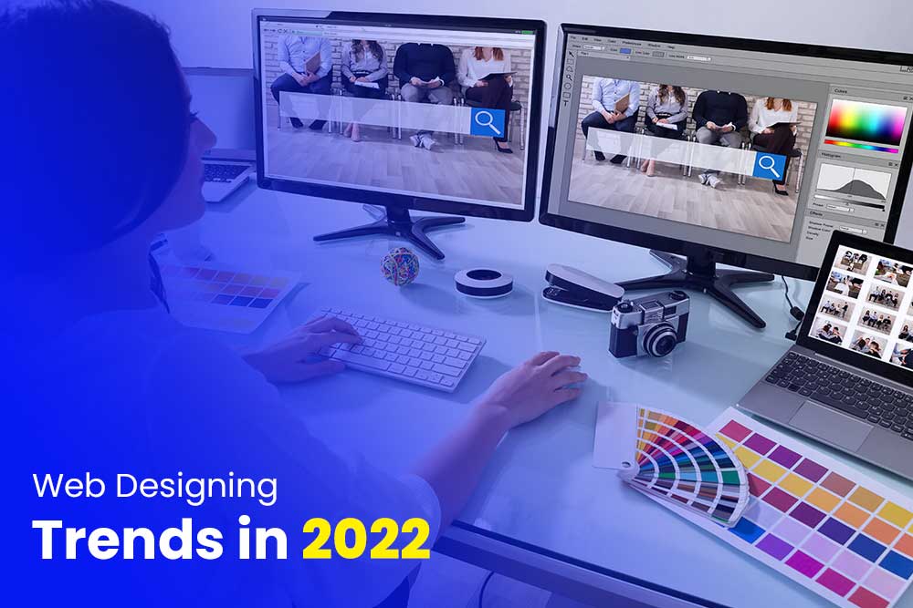
Website designing trends are constantly changing. The good news is that it’s easier than ever to keep up with the latest trends. In this article, we will go through some of the website designing trends for 2022 and what you can do to adapt them for your own website.
The first trend is that websites are becoming more minimalistic. This might seem like a contradiction because we all know how much information is available on the internet. However, people are starting to realize that too much information on a page can be overwhelming and lead to visitors leaving your site without engaging with any of your content.
The website design industry is changing and so are the design trends. The rise of responsive web design, new tools, and a better understanding of user behavior has led to some significant changes in how we build websites today. To help you stay up-to-date with these latest trends in website designing.
Most Popular and New Website Designing Trends in 2022
1) Flat Design –
Flat design is a style that has been used by many websites in the past few years. It is a popular design trend because it is simple, minimalistic and easy to use.
The main goal of flat design is to remove all unnecessary clutter and make the user focus on what they need from the website. The lack of shadows, gradients, textures and other visual effects makes it easier for people with disabilities to use the website as well. This style has also been used for mobile devices because it does not require any heavy processing power or high-end hardware which would make it difficult for people with low-end phones to access the site.
Flat web designs are usually more modern than other styles of website design because they are designed to be responsive to different screen sizes. This means that they will look good on any device or screen size.
2) Grid Design
The grid layout is a design technique that arranges content into rows and columns. It is a popular technique for web design because it provides a clear, easy-to-follow structure for the user to navigate the site.
A grid layout typically consists of a combination of rows with equal height and columns with equal width, but can also be created with unequal height or width columns. Grid layouts are often used to create websites that have wide content areas, such as blogs or news sites.
A grid layout can be used for any type of content, so it’s not just limited to blogs or news websites. You can use grids to design landing pages, portfolio websites, or even e-commerce sites!. The grid layout is the most popular website layout because it offers a lot of flexibility and simplicity for users.
3) Minimalist Design
The minimalist website design is a trend that started in the early 2000s. Designers shifted from complicated, cluttered designs to clean, minimalistic layouts.
Minimalist websites are designed to be simple and clutter-free. They are often characterized by their use of white space, large blocks of text with few graphics or images and a lack of animation or sound. The goal is to make the site as easy as possible for the visitor to navigate and find what they need quickly and easily.
But now, Minimalist website designs are becoming more and more popular. With the rise of smartphones, people are going online more often and they want to be able to access the information they need as quickly as possible. Designers have been adapting to this new trend by creating websites that load faster and are easier for users to navigate.
The demand for minimalist website designs is steadily growing, but it’s not just about aesthetics. It’s about providing a clean and simple user experience that will provide the best experience for your customers. Some of the benefits of minimalistic design include: Easier navigation, Cleaner look, and Less clutter
4) Responsive Design
A responsive website design is a type of web design that changes its layout depending on the size of the screen it is being displayed on. It uses fluid grids, flexible images, and media queries to create a design that can be viewed comfortably on any device.
A responsive website design adapts to the size of your screen, whether you’re looking at it from your phone or computer. This means that you can still enjoy the same content no matter what device you use to browse the web.
In order for a website to be responsive, it needs to have a flexible grid system that can rearrange the layout of the site based on the screen size. It also needs to be coded in such a way that it can resize images, text blocks, videos, and other media files so they are viewable on different devices with different resolutions.
5) Inclusive Design Mania
Inclusive Design Mania is a movement that began in the early 2000s. It is a design philosophy that emphasizes the importance of designing for all people, not just for those who are considered “the norm”. The goal of this movement is to empower users and make them feel like they can use any website without any barriers or difficulties.
Inclusive Design Mania is a process of designing websites in such a way that they are accessible and usable by all users irrespective of their age, gender, disability or any other factor. It is not just about designing websites but also about ensuring that these are responsive and compatible with different devices.
It is important to note that Inclusive Design Mania focuses on the usability aspect as well as accessibility, which means it should be able to work with any device regardless of age or disability.
6) Typography Animation
Typography Animation trend is a new trend in website designing. It is a design trend which helps designers to create an interactive and immersive experience for the user.
Typography Animation is a new design trend that can help designers create an interactive and immersive experience for the user. The typographic animation will be able to communicate with the user in a more engaging way than any other form of communication before it. It will also be able to provide more information about the subject matter that you are discussing, without having to use any text at all. This would allow designers to make their designs more appealing and memorable, as well as more informative.