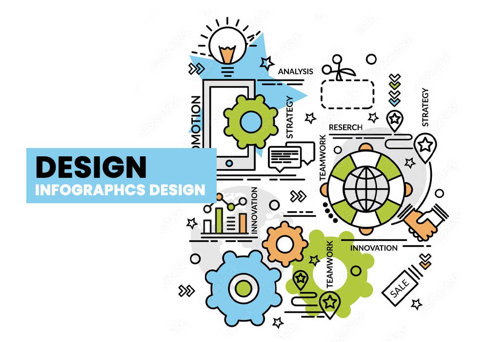
An infographic is a graphical representation of information, data or knowledge intended to present complex information quickly and clearly. Infographics are used when there is little time for readers to process long blocks of text. Infographics are popular when it comes to teaching, research, and marketing because they simplify complex topics visually.
The term Infographic was first coined by Mr John Mair in 1983 and is derived from the words Information and Graphic. The word infographic is widely used for data visualizations but the word Infographics is generally used for any kind of visual presentation of information with the use of graphs, charts, diagrams, photographs or illustrations.
An infographic can be created using a variety of tools such as Adobe Illustrator, Inkscape or Microsoft Powerpoint. They are usually available in JPEG or GIF file formats that can be shared on social media platforms such as Facebook or Twitter
An infographic can be a picture or a chart with textual elements that annotates the image with additional text in an attempt to add meaning. Infographics are used to illustrate any complex idea that can be depicted through graphics like statistics, maps, timelines and other representations of real-world data.
9 Types of Infographics

Infographics are a great way to communicate messages in an attractive and memorable way. They are perfect for telling complicated messages in an easy-to-understand way.
Some of the most common types of infographics are:-
1) Product Infographics:
Product infographics can help you build awareness about your product, educate your customers about its benefits, and showcase it in an interesting new light.
Product infographics are an excellent way to provide more information about the product to the consumers, even if they are not tech-savvy. In this way, companies can get their products seen by many more people. Infographics also get shared on social media outlets quite often which can lead to new audiences for your company’s products. Product infographics are gaining popularity because they condense complicated information into an easy-to-digest form for customers. These infographics can be shared on social media platforms such as Facebook or Twitter to reach a wider audience.
2) Infographic Resumes:
An infographic resume provides a combination of visual interest and helpful information that may be more appealing to hiring managers than a traditional resume or CV.
Infographic Resumes are an eye-catching way to get attention from potential employers. They are not the only type of resume though.
An infographic resume is a visual representation of your skills, work experience, and education that use charts, graphs, illustrations, and other graphics to present information. Employers are attracted to them because they provide more information in less time.
The use for this type of resumes is not limited to digital media professionals either – it’s also used by engineers, educators, healthcare practitioners among others.
3) Content Infographics:
Content infographics visually display data and statistics by using images and illustrations, often with arrows and labels to guide the reader through the infographic. Infographics are used for many purposes including to explain complex topics or tell stories. They can also be used as persuasive devices to communicate facts about specific subjects with an audience more effectively than words alone might.
Content infographics are used in many different fields, such as healthcare, the environment, and communications. They can also be used in personal blogs to show how your life compares with other people’s lives.
4) Database Infographics:

Database Infographics is a web app that allows you to easily create customized infographics from your database. It lets you import data from Excel, CSV or Google Sheets and then build an infographic with a drag and drop interface.
This platform is not limited to displaying data in charts – it can also be used to show the geographical distribution of the data. You can even customize the style of any element on the infographic, such as changing text fonts, colors or size.
Database Infographics is a web application that offers a more practical way for people with little-to-no graphic design skills to create infographics from their databases.
5) Pictorial Infographics:
Pictorial infographics are a form of data visualization that uses images and visuals to illustrate complex concepts. Images can be used to represent numbers, statistics, or data points.
Pictorial infographics are growing in popularity as they have a better chance of getting shared on social media. A pictorial infographic can reach a wider audience because it is easier for people to understand the message conveyed through the image.
Pictorial infographics have many different types of techniques which allow them to be more effective at communicating certain messages. For example, statistics can be represented by making them into proportions and using circles as pie charts to show the percentage they represent within a whole.
6) Statistical Infographics:
The main objective behind using Statistical Infographics is to visually convey information that can be difficult or impossible to explain through text alone.
An example of Statistical infographic: A pie chart, which represents the different sources of energy for transport sector – cars, buses and trains – and the percentage they contribute (Source: Statista).
People want their infographics to be engaging and fun, so they turn them into games such as “the dice game” which shows how interactions can influence the outcome of a statistical graph.
7) Conceptual Infographics:
Conceptual Infographics is a concept from the field of information design. This concept has been used to describe data displays, charts, and graphics that are designed for understanding not only the quantitative aspects of a situation but also how it feels.
The main goal of conceptual infographics is to inform readers about a particular topic in a way that will be easy for them to understand while being visually enjoyable. These infographics often have informative elements such as charts and graphs, but they also may have less “traditional” elements such as quotations or images that represent the topic in a unique way. The goal is to generate interest in the topic by being engaging and thought-provoking.
8) Activity Infographics:
Activity infographics are visual representations of movements of an object. They use different shapes to represent the movement of an object in a given period of time.
An activity infographics is a visual representation of the movements of an object over various periods. The shapes used to represent this movement can be triangles, circles, or rectangles that are placed on the same axis to represent time.
9) Grid Organized Infographics:
Grid Organized Infographics is a popular form of infographics and is used to present data in an easy to understand way.
The design of grid-organized infographics is best for topics that have a lot of data and need to be presented in a clear and simple way.
A grid template would be the ideal layout for such infographics because it can create uniformity throughout all the images, making it easy for the reader to compare the numbers.
An Infographics which speaks to customer
Include a clear and concise title
Many people are often missing the point that a good title should also be clear, concise, and accurate. The purpose of infographics are for an easy-to-understand visual representation of information. The goal should be to communicate ideas as quickly as possible with clarity and accuracy.
A clear and concise title will help readers understand what the article is about. It also helps them know if they want to read on. If you want to make your title clear and concise, you can follow these simple steps:
1) Be specific
2) Avoid cliches
3) Use active verbs
4) Eliminate superfluous words
Share your data with readers through easy-to-read charts and graphs
Infographics are not just fun to look at – they are also a way to present information in an easy-to-read format. Infographics can also help you make your data easier to understand because the reader has the ability to focus on one part of the infographic at a time. For example, by looking at a chart rather than reading through a long paragraph about the same information.
This method of presentation is effective because it makes use of more than one of the human senses, sight, touch and hearing which can be a problem with just text or text together with images. It also saves time for readers as they don’t have to click from page to page.
Understand the intent of the infographic and choose a topic that aligns with that intent
As you are reading the infographic, you should be able to define the intent of the infographic. For example, if you are reading an infographic about animal conservation, then it is clear that there is a focus on animals and not humans.
A good infographic has clear graphics, easy-to-read text, and relevant information in an engaging way.
The following are some tips on how to understand the intent of the infographic and choose a topic that aligns with that intent:
- Determine what type of information is being presented or what type of audience is being targeted.
- Choose a topic that corresponds with the type you determined. For example, if you determine that the target audience of an infographic is for new parents, then you should probably make your topic about parenting skills for new parents.
- Determine whether or not there are any emotions involved or if there’s any need for persuasion, excitement, or humor.
Use color wisely and sparingly
Color is an essential part of infographic design. It not only helps to convey a message or highlight the most important information, but also influences our moods and perceptions. Now just, look at how you can use color wisely and sparingly in infographic design.
- Choose a single color for the background of your infographic – it’s best to choose one that’s light or a shade of grey.
- Use two colors for text and graphics – these should be complementary colors, meaning they have a high contrast with each other. For example, green on orange or blue on pink.
- Avoid using more than three colors in an infographic unless you are making a map or doing something creative like illustration with different mediums.
Create an infographic that is designed to be shared on social media
The infographic should be designed to be shared on social media. It should also be easy to read and understand.
It is important for an infographic to be as visually appealing as possible. This is because it will likely be advertised on social media platforms, where images are typically used more than text. Users will scroll through their feed and spot the infographic, so it needs to stand out from the rest of the posts, and catch their attention. The colors and fonts used should also match the branding of the company or organization producing it, or that of its target audience.