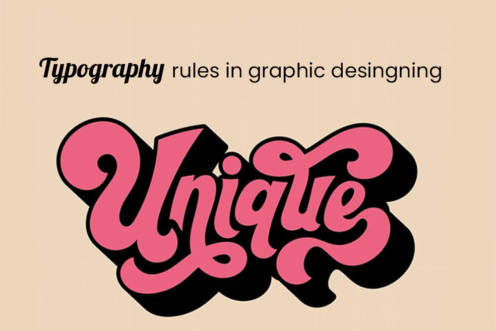
The typography rules in graphic design are not only important to adhere to, they can also be used to creatively construct a layout that is more visually appealing. Some of the typography rules that are often utilized in graphic design, and how they’re applied.
Typography is the style of text formatting and letter formation within an image. Typography comes from the Greek word “typos” which means “impression” or “type.”
Typography can be defined as the art and technique of arranging type. It is a subset of graphic design, one that deals specifically with the size, style, and spacing or letterforms. Typography is an important aspect in visual communication because it creates a distinction between text and images. It can also have a significant impact on how readers interpret written text.
We are providing typography rules for graphic designers to follow to ensure that their designs are successful.
Font selection
Font selection should not be taken lightly because it can affect readability, legibility and attractiveness of your design.
Font selection is a typography rule because it affects the way people read and comprehend text. It can affect the mood of a document by changing how you interpret the content and the tone of voice that is being used.
You should select typefaces based on their utility, aesthetics, and relevance to your content. The typeface you choose must have sufficient contrast to be readable without being hard on the eyes, but not so much contrast as to hinder readability.
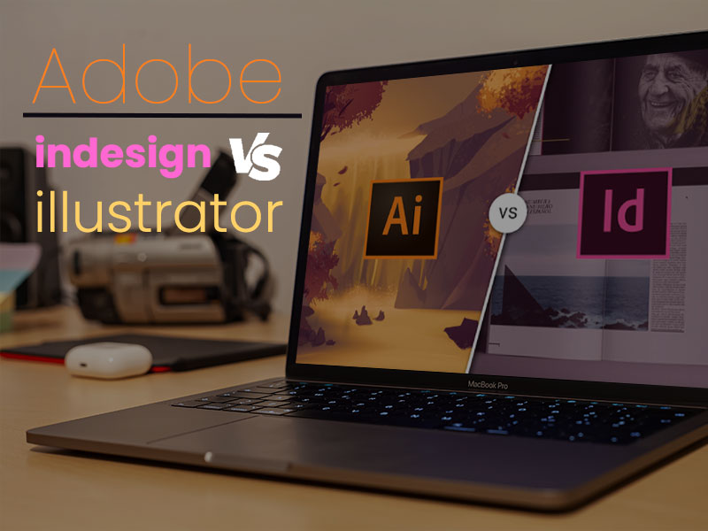
The type palette is a customizable design tool available in many applications such as Adobe Photoshop and Illustrator that allows you to select fonts and preview the type effects that they produce.
Size and Scaling
Choosing the right font size is often considered a typography rule. It’s important to choose a font size that is easy to read, and at the same time makes the text look sleek and tidy.
In typography, size selection is an important rule. Different sizes of the same font add a different meaning to the word.
The scale of a typeface is determined based on its x-height and its body size in relation to different typefaces. Typographic scales may be classified as text, display, and caption.
Text: A typeface in a text scale creates a feeling of simplicity and legibility with regards to readability at small sizes. The capital letters are often designed with serifs or other embellishments that make them more readable at small sizes. A good example might be Times New Roman or Verdana
Display: Display fonts are typically large-scale versions of their text counterparts created for use at larger point sizes, usually over 18 points in size.
The reason for this is because of how our eyes work. They can focus on one small area for periods of time, which means that larger fonts will be easier to read than smaller fonts. On the other hand, too large a font will also be hard to read because it will take up more space on the page.
The best way to find a good font size is by using a scale where you increase or decrease the size by 1 point at a time until you find one that looks good.
Leading
The leading is the vertical space between lines of type in a given point size. This space can affect legibility and readability. The most common cause of bad leading is that the lines of type were simply set too tightly together, resulting in a lot of white space at the bottom and top of each line.
Tracking and kerning
Better tracking and kerning is necessary for your typeface choice to succeed. If your typeface isn’t professionally kerned and tracked, then the letters won’t sit together properly on the page and will instead look jagged or unprofessional.
Tracking mainly changes the spacing between whole words or lines of text, while kerning usually affects only letters that are touching each other in a word. Tracking is done by adding spaces to make up for what you have taken out, while kerning is achieved by adjusting the space between two letters to compensate for any overhang.
Measure
Typography is the art of arranging type to make written language legible, readable, and appealing when displayed. There are many rules when it comes to typography that are meant to improve your writing in some way.
The better Measure of text rule is one of these typography rules. The point of the better Measure of text rule is for it to be easier for readers with smaller screens or high resolution screens. This rule sets a limit on the number of characters per line so that your writing isn’t too dense or too sparse.
The better Measure of text rule forces you to set limits on how many words you put per line which will inevitably lead to more white space on the page, less reading time, and less scrolling time for readers with smaller screens.
Hierarchy and scale
The hierarchy and scale of text is an integral rule of typography. It is what creates the structure and organization to a layout. It establishes the framework for reading and understanding a document. Without it, there would be no way to sort through content – such as titles, subtitles, text blocks, captions and so on – that would be cluttered or difficult to follow.
Hierarchy structure establishes the relationships between all the pieces of text found in a layout. The hierarchy of typeface weight are related by 1 whole point difference in weight. The hierarchy of typeface styles are related by 1 different design style or variation between them, for example italicized or bolded fonts.
Widow and Orphan
Widows are words that are left without a preceding line. Orphans are words that are left without a following line.
A widow is a word, or sometimes just part of a word, at the end of a paragraph which appears alone at the bottom of an otherwise empty page. It is so called because it becomes the “widow” or solitary survivor of something lost or destroyed. An orphan is a word, or sometimes just part of a word, at the beginning of the first line of text on an otherwise empty page. It is so called because it becomes the “orphan” or solitary survivor of something lost or destroyed.”
Widows and orphans are two types of widowed lines that occur in typewritten or electronic copy. The term “widow” refers to one line (either full or partial) left at the top of a column; “orphan” refers to one line (either full or partial) left at the bottom of a column.